
In 1992, Liturgy Training Publications published Regina Kuehn’s A Place for Baptism. It quickly became one of the most respected and used guides for the design of baptismal fonts, particularly for Catholic churches. Rather than the book being a collection of baptismal fonts through the years, A Place for Baptism is carefully organized into ten distinct chapters. The first seven chapters are focused on the symbolic or sacramental dimensions of the baptismal font, with the last three dedicated to the more practical concerns relative to building and locating a baptismal font.
Whenever I meet with a Catholic church committee to discuss the design of their baptismal font, this is one of the two books I always use as a reference. We start, of course, with Built of Living Stones for general guidance relative to the role and placement of the font in the church. But when it comes to what the font should look like, we turn to A Place for Baptism to determine which shape is most appropriate for this particular church. Ms. Kuehn’s well-written chapters help us to make that decision together.
Over the years during which I have been designing churches, I have designed many new baptismal fonts. Although I always discuss the full range of options with the committee, most churches choose from four of the seven shapes described in the first seven chapters. As a sort of supplement to the wonderful illustrations in A Place for Baptism, I have gathered examples of the fonts that I have designed that relate to four of the first seven chapters.
Chapter 1: The Font as Womb
“The greatest agent of transformation is the womb; it changes the past into the future. Combining these two images, the water and the womb, a community makes a strong statement about the nature of baptism.” (page 7)
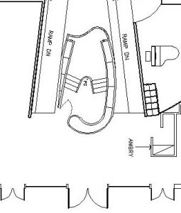
Baptismal Font as Womb – St. Pius X Church, Montville, NJ
While most of Ms. Kuehn’s examples of fonts as womb read in “elevation”, the baptismal font we designed for St. Pius X Church in Montville, NJ translates the womb shape into a “plan” view. The shape of the font resembles the human womb when viewed from above. The change from past to future is emphasized by the entry at a higher elevation into one end of the “womb”, near the entry into the worship space, and the “birth” at the other end, after stepping down into and through a large pool of water at the base of the “womb”. Although this font has yet to be built, a simpler version was built at the Church of Corpus Christi in Ushers, NY. By choosing to build such a large font, this community clearly wished to make a very strong statement about the importance of the sacrament of baptism to them.
Womb-shaped font at Church of Corpus Christi
Chapter 3: The Tomb-Shaped Font
“There is no question that a tomb-shaped font is always relevant to the understanding of the sacrament. The power of the water, kept in a tomb-shaped font, is immediately understood and we sense the transcendence of the element. We know that we are not facing H20 but a symbol of Christ’s death and resurrection – and our own.” (page 25)
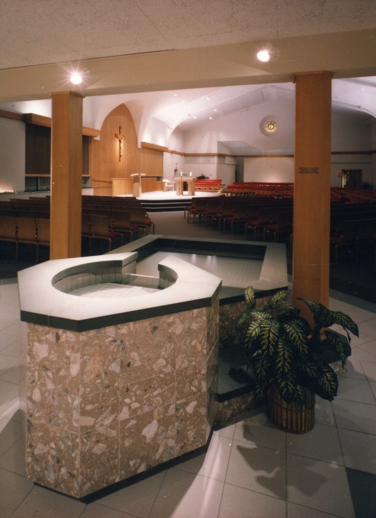
Tomb-shaped lower font at Our Lady of Mercy Church
The very first baptismal font that I designed included a tomb-shaped lower basin, connected to an octagonal upper basin. The committee at Our Lady of Mercy Church in Colonie, NY (which is now being used by a Baptist community), wanted to have a large enough area for both the baptized and the baptizer to be in the water together. Steps into the font on either side of the upper basin (hidden in this photo by the plant) allowed the catechumen and the priest to each enter the font from different sides, joining together in the baptismal waters for the sacrament. Once baptized, both the neophyte and the priest would then exit the font via wide steps at the other end of the font, entering directly into the area of the assembly. Through this movement, the symbolic journey of dying to sin and being brought to new life through the sacrament of baptism is made clear to all who observe or participate.
Chapter 4: The Step Down Font
“Another step in appreciating what all Christian churches hold in common regarding baptism is to become familiar with the practices and images of the early church.” (page 39)
In this chapter, Ms. Kuehn discusses the design of ancient fonts in Mount Nebo and Ephesus. During my visit to the excavations under the Duomo in Milan, I saw the ruins of an early step-down font. A nearby display explained how the font worked. I include that image below, as it illustrates Ms. Kuehn’s comments about practices of the early church. (Please click on the image for a better view.)
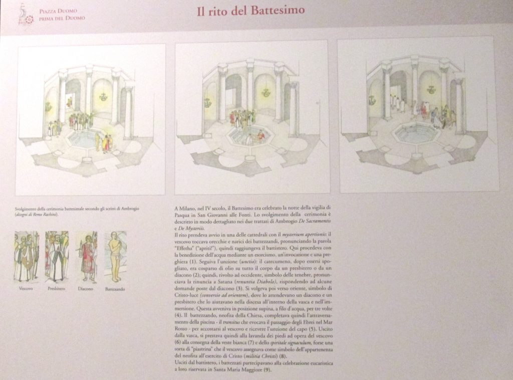
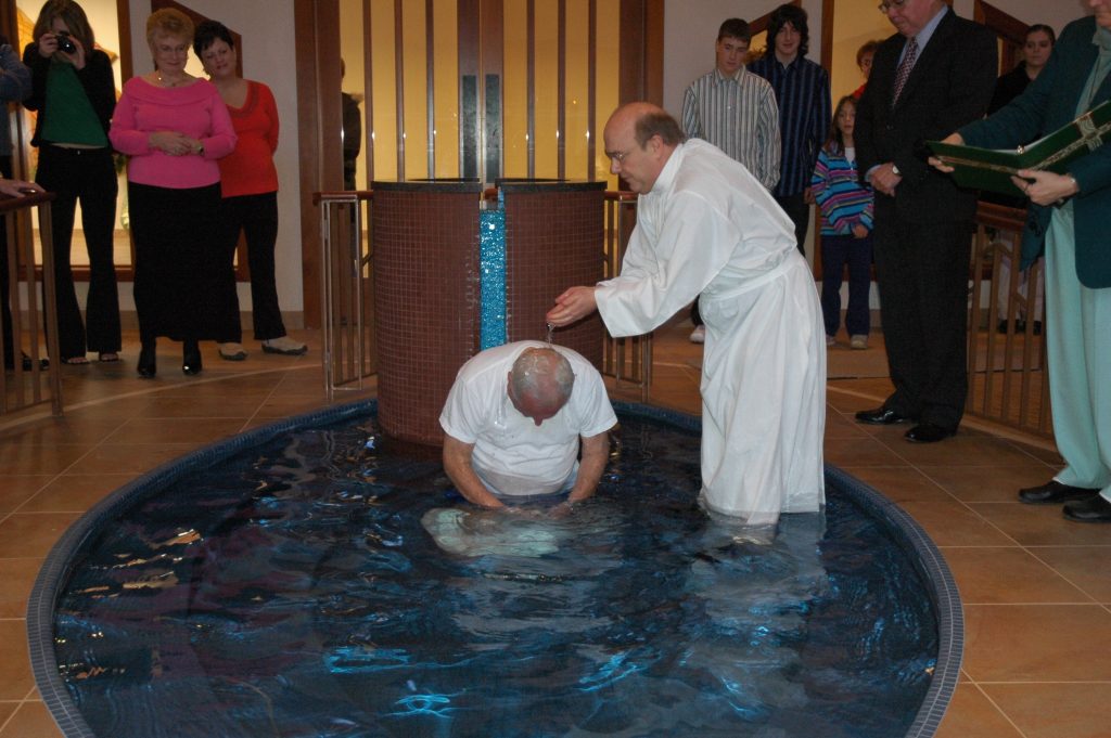
The Baptismal Rite
Notice the movement of the people involved in the rite. After the anointing, the catechumen turns toward the east, symbol of Christ-light (conversio ad orientem), where he awaits a deacon and a priest who help him on the way down into the font. After being submerged in the pool three times, the candidate, the neophyte of the Church, then completed the crossing of the pool – the transitus that evokes the passage of the Jews in the Red Sea – to approach the bishop and receive the anointing of the head.
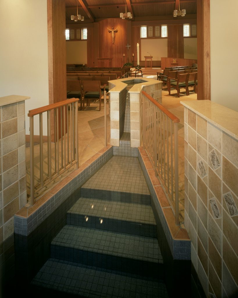
Step-down font at St. Kateri Tekakwitha
The font at Corpus Christi (pictured earlier in this post) is the largest example of a step-down font we have ever designed. On a smaller scale, the font at Saint Kateri Tekakwitha Church in Schenectady, NY (formerly Our Lady of Fatima) features a step-down font, connected to a hexagonal upper font via a river-like transition. For safety, parts of the lower basin are enclosed with 42″ high walls. Some of the adults who have been baptized in this font (which is large enough for complete submersion) report that it is a very powerful experience, as the surrounding walls create the feeling of going deep into the earth. As they climb out of the lower basin and into the light of the Narthex in which it is located, heading toward the gathered assembly, they experience the same transitus described above.
Chapter 5: The Octagonal Font
“If the number 6 represents the death of Christ on Friday, then the number 8 points to the eighth day, the day after the Sabbath, the day of resurrection.” (page 53)
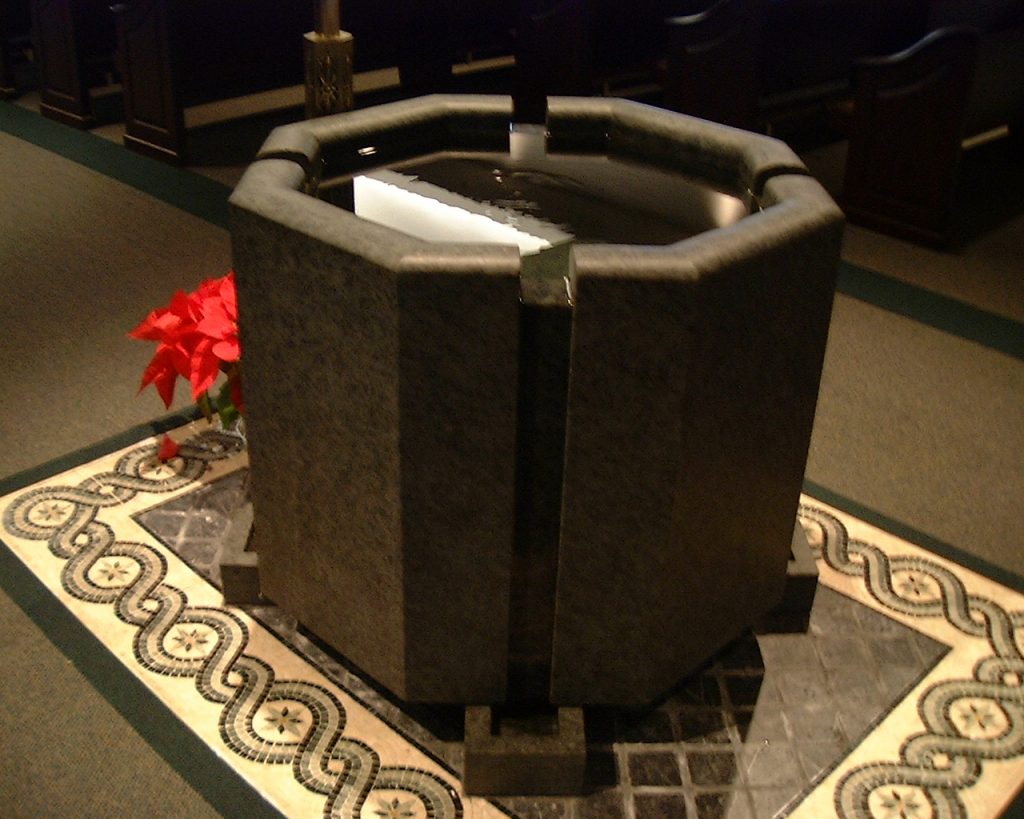
Octagonal font at St. Mark’s Church
The octagonal shape for a font has probably been the most popular choice for new fonts. Both the symbolism and the shape are appealing to most people. With its lack of sharp corners, it easily approached from all directions, which is particularly important when the font is located in a central place, approachable from many directions, as is often the case. One of my favorite fonts in this category is the font at St. Mark’s Church in Long Valley, NJ. Carved from a single piece of granite, water flows from four sides of this font into a cross-shaped water collector that lifts the font off the floor. A drain directly under the font also collects water that drains via the mosaic tile floor where adults stand to be baptized by the pouring of water over their bodies.
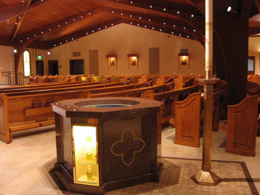
Octagonal font at Church of the Holy Spirit
This same concept of an octagonal font for infant immersion and an area for adult baptism by pouring of water over them was used at the Church of the Holy Spirit in Cortlandt Manor, NY. This font, made of granite panels rather than of solid granite, includes a custom-designed mosaic bowl for infant immersion and for blessing. The drain for the adult baptisms is a custom-made bronze drain off to the side, set into a beautiful mosaic floor pattern that designates the place of baptism. (In this photo, the drain is covered by the Paschal candle.)
Chapter 7: The Font as Tub
“The key sentence for font builders in [paragraphs 76 & 77] of ‘Environment and Art in Catholic Worship‘ seems to be that ‘a font should be so constructed to allow the pouring of water over the entire body of a child or adult.’ This makes physically possible a ritual bathing, a washing away of sins.” (pages 75-76)
Font as tub at Our Lady of the Assumption Church
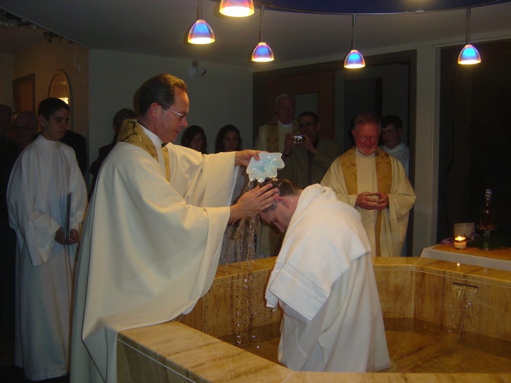
Only one of all the parishes I have worked with over the last 23 years has opted for a font as tub. At Our Lady of the Assumption Church in Latham, NY, a large, octagonal tub was placed at the entry to the church during the renovation of the church in 2006. The tub is made of 32 individual pieces of carefully matched marble, quarried from the same Italian quarry as the original liturgical furnishings in this early 60’s church. A continuous waterfall of water creates sound and movement in the baptismal waters. Although it is suitable for both infant and adult immersion, somewhat surprisingly, immersion is only being used for adults. Adults and children desiring to be baptized at this church are given the option of being baptized in the font or standing next to the font. The vast majority choose to be baptized in the font, where they kneel down in a white alb and have a large volume of water poured over their head by the priest. It is my belief that this form of the rite is extremely effective in conveying the washing away of sins that the sacrament provides, which is why it is chosen by so many adults and older children. What a powerful act of grace!
Summary
The determination of the location and shape of a baptismal font for a new or renovated church is often a long process. Starting with education, then dispelling misconceptions and opening the view of the committee to all the wonderful possibilities all takes time. Then there are the questions of the water itself – does it move? (it should!), how does it move? how much noise does it make? how much water should there be? how do we keep the water fresh?, etc. are all topics for discussion and discernment. The actual building of the font itself is equally complicated. Careful design, engineering and execution are all essential to a successful, usable font. Nothing is sadder than a large font that sits empty because it is too hard to maintain or – worse yet – leaks! Given the importance of the sacrament of baptism as the entry into the church, the design of the baptismal font is of great importance and the task should be given all the attention it deserves. I truly enjoy this design process and look forward to designing many more baptismal fonts in the future – perhaps for the church of you, the reader of this post!